- Deutsch: Diese Seite ist nicht ins Deutsche übersetzt
Grid analytics
Grid Analytics provides power grid owners complete visibility into their entire physical grid system. The grid intelligence provided supports risk mitigation strategies as the condition-based data is accurate, objective and linked to imagery, so the grid can be visualized from the desk. Grid analytics is the place where you can drill down into an individual asset and get a complete overview of the structures' components and the history behind that asset with a clear audit trail.
Data
You should be able to trust the data in Grid Analytics. It only contains data from approved project groups. This means that as long as the process has been followed data has been linked to the correct asset, the input data has been quality assured, components and observations has been registered and quality assured.
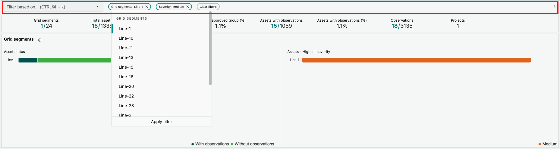
Filters
At the top of the screen there is a section with filters. This can be used to select an attribute to filter on, set the appropriate values and filter all sections with e.g. KPIs, graphs, tables, maps etc to display only the data that is of interest
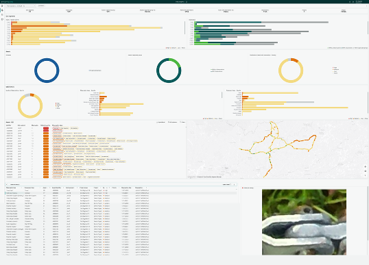
KPIs
In the KPI section aggregated numbers are displayed to help you understand the data volumes at a high level. Without filters being activated the numbers show aggregates across all assets that has been registered in Grid Vision and observations from approved project groups. When a filter is active the aggregates are recalculated to show aggregates for data within the filter range in relationship to the aggregates for the entire grid.

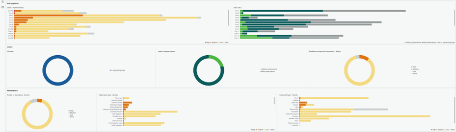
Charts
There are multiple charts of different types to help visualize data to make it more perceivable. They are grouped into sections, e.g. one section each for grid segments, assets and observations. This means the data is aggregated on different levels depending on what perspective you are after.
In the grid segment section the focus is on the number of assets belonging to each grid segment (a grid segment can correspond to e.g. a line or circuit or feeder). The charts help you to understand what assets in each grid segment has been inspected or inventoried (included in an approved group), if the asset has got observations and if it has got observations what is the highest severity level for that asset.
In the asset section the focus is on the assets and show what assets have been included in approved groups and if the asset has got observations.
In the observation section the focus is on the observations. It gives an overview of how many observations have been registered for each level of severity/priority. It also shows the number of observations registered on each observation type and component.
By clicking on data in the charts a filter will be activated in the filter section. E.g. if you click on a bar that show high severity observations in a chart the entire dashboard will be filtered to show only high severity observations.
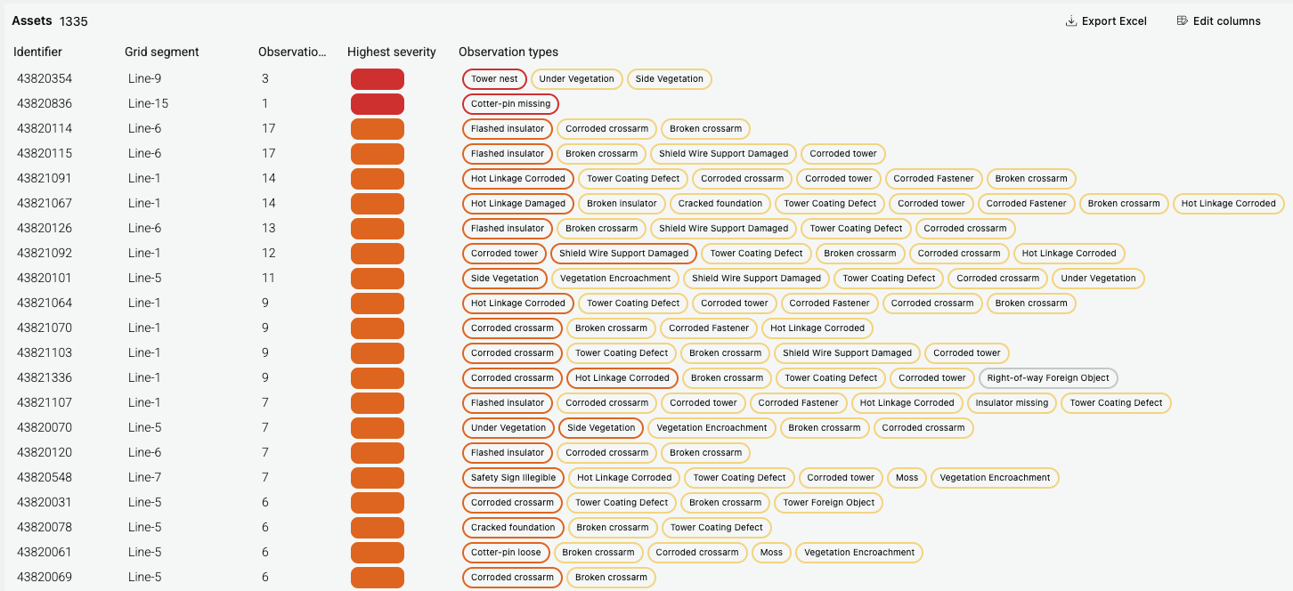
Tables
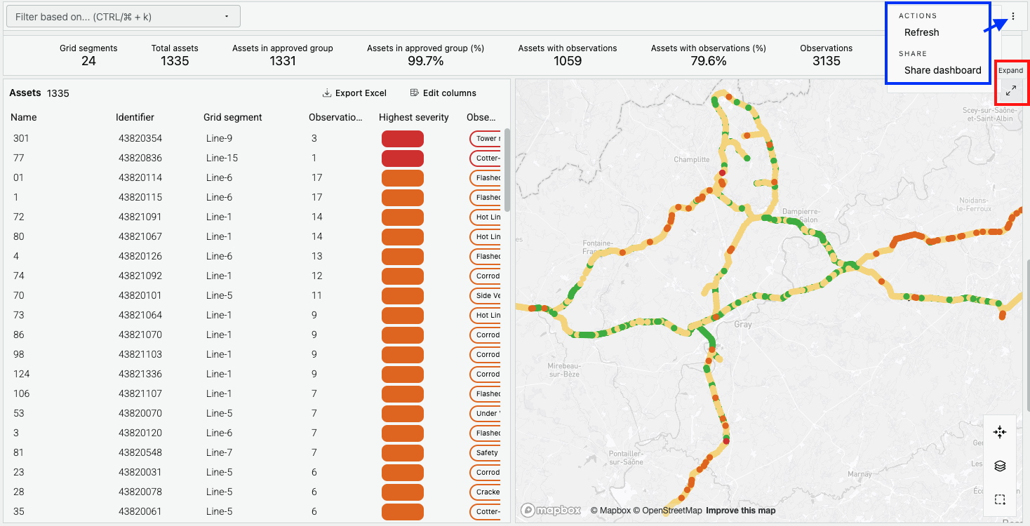
There are multiple tables showing data on a more detailed level and also allowing for exporting the data. You can decide what columns to show and to hide. When you click on the export button data for all visible columns will be exported. You can also sort the table based on each column.
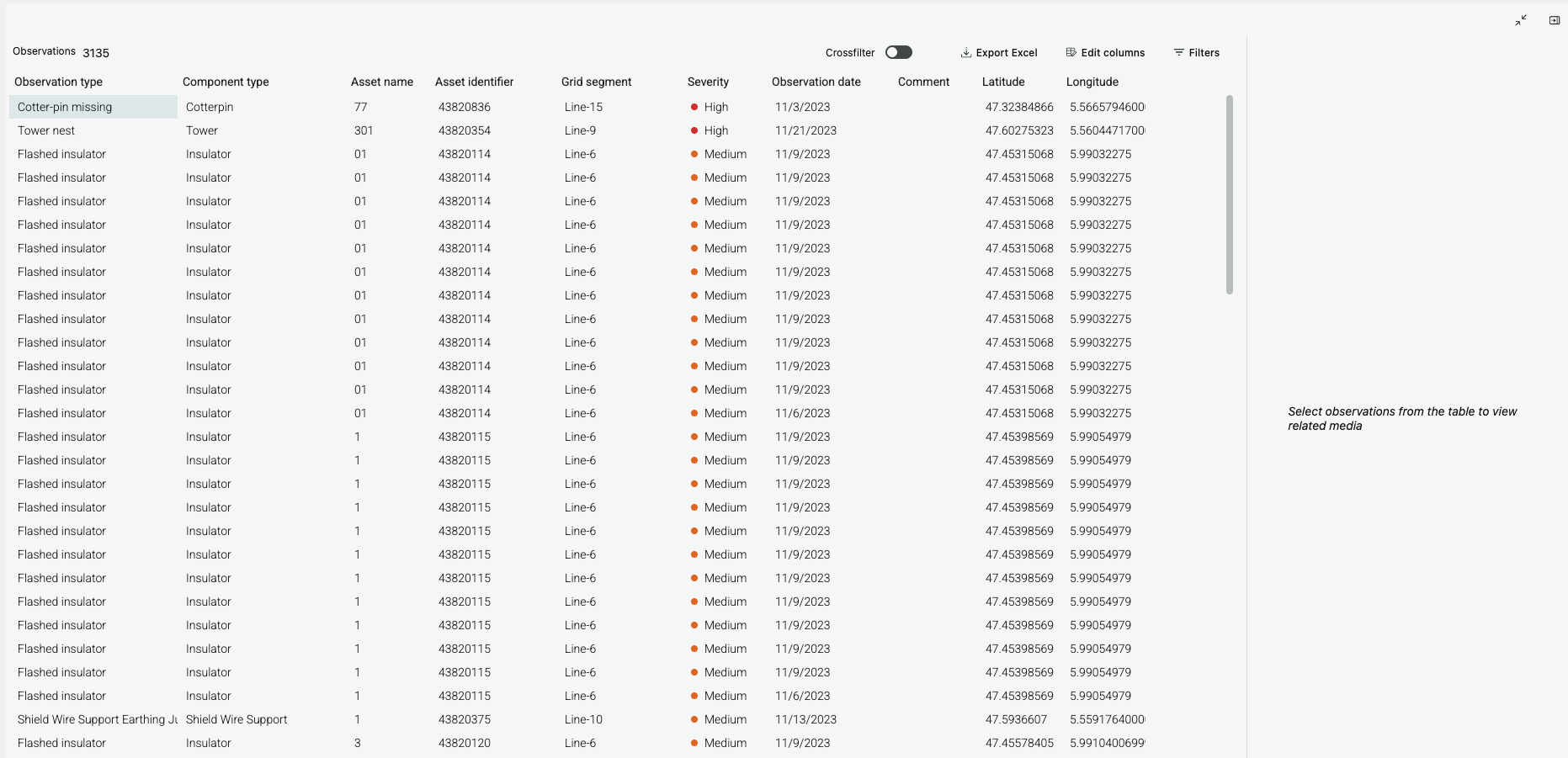
The table with observations also have the possibility to activate some filters that are not included in the filter section. When the filter is applied from the observation table it will by default only filter the table. If you want to apply the filter to the rest of the page the crossfilter toggle should be activated.
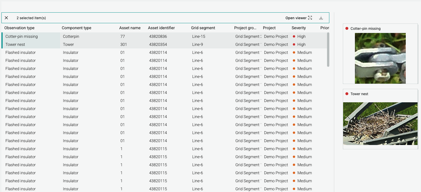
When one or more observations are selected in the table the media viewer will show the images corresponding to the selected observations. The media viewer can be collapsed or expanded. It possible to open each image in a full screen view from the thumbnail and it can also be downloaded.
Map
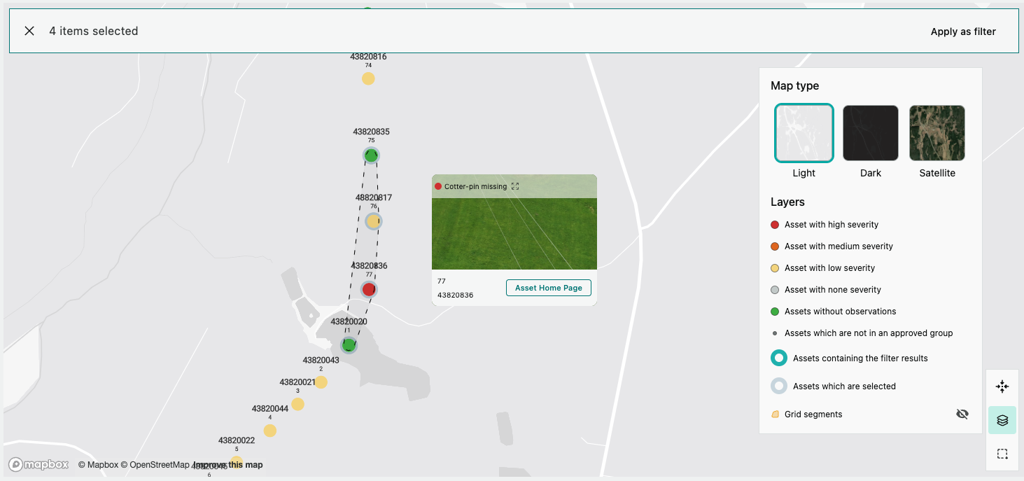
The map show all assets in the grid. The assets are color coded to show if they have been included in an approved group (e.g. the inspection has been approved), if they have been inspected without observations or if they have been inspected with an observation. If the asset has got at least one observation the color of the asset will reflect the observation with highest severity. The layer selector show a description of all layers and the colors and symbols in the map. There it's also possible to change the base map between light, dark and satellite mode. Asset and grid segments can be selected in the map and apply the selection to the filter. When clicking on an asset the compact view appears, it's a box with key information about the asset. It also contains a button that allows the user to navigate to the asset home page. The asset home page can also be opened by clicking on the asset name in any of the tables.
Other features
Each section can be expanded to cover the entire page except the filter section and KPIs. It's possible to activate filters and change columns and share it with other users.