- Deutsch: Diese Seite ist nicht ins Deutsche übersetzt
Introduction to Grid Vision
Grid Vision enhances project management through a carefully structured interface, divided into eight key sections. Each section is designed to facilitate specific aspects of project management and navigation. Below is a detailed breakdown of these sections and their key components.
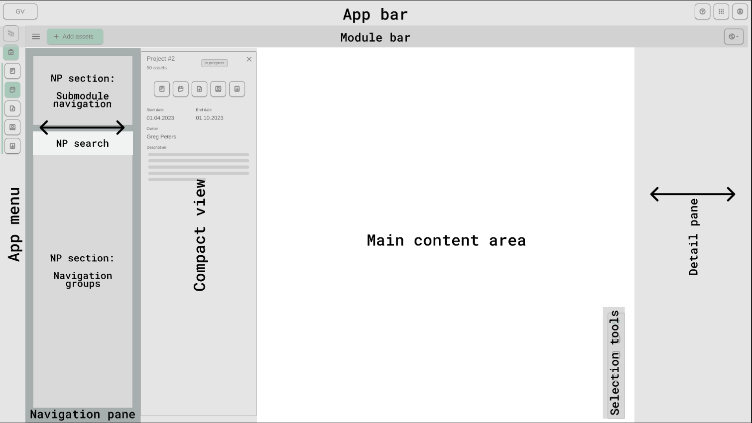
App bar
The topmost section of the interface, provides you with essential navigational tools and quick access to various functionalities.
App bar components
- Grid Vision Logo :
Located at the top left, the logo not only enhances brand identity but also serves as a convenient way for you to return to the landing page which is Project manager from any page within the application.
-
Help Icon/button :
This feature offers you access to support resources such as guides, FAQs, and contact channels for assistance.
-
Settings :
The Settings option allows you to customize the theme and language of the application.
-
[ ] Theme Selection: You can choose from the following themes:
- System: Adapts to the system's default settings.
- Light: A bright and clean interface.
- Dark: A visually soothing dark interface.
-
[ ] Language Selection: You can select their preferred language from the available options:
- English
- German
-
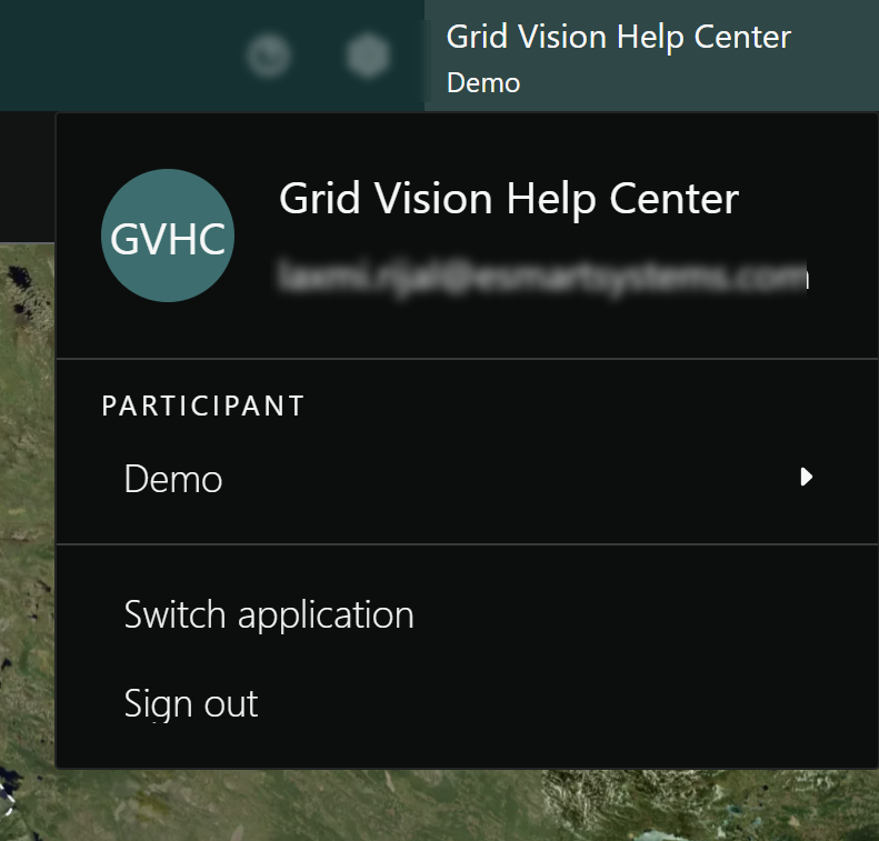
Profile Banner:
When clicking on the profile banner, in the upper right corner, the profile banner displays your name and company/participant name. Clicking on this banner reveals a menu containing the your email address, participant selection option, switch application option, and the sign-out button.
Module bar
The Module bar, located directly below the App Bar, offers tools and shortcuts for efficient project management. Similarly, the information on module bar adjust dynamically based on your application navigation.

Module bar components
-
Menu icon : Reveals additional navigation options or features.
-
Create new project button : Initiates new project creation with necessary details.
-
My Work : My Work: Displays the tasks assigned to you (if any).
App menu
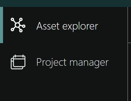
The App menu, situated on the far left of the page, lets you switch between the Asset explorer and Project manager. At the bottom you can click to expand/contract the menu.
App menu components
- Asset explorer : Central location for managing and accessing your assets.
-
Project manager : A list and access point for all your projects. When this is selected a sub menu appears for the sub modules Plan, Collect, Work, and Report. These applies for the currently selected project.
-
Show/hide app bar : Toggles the visibility of the App Bar for more screen space.
Navigation pane
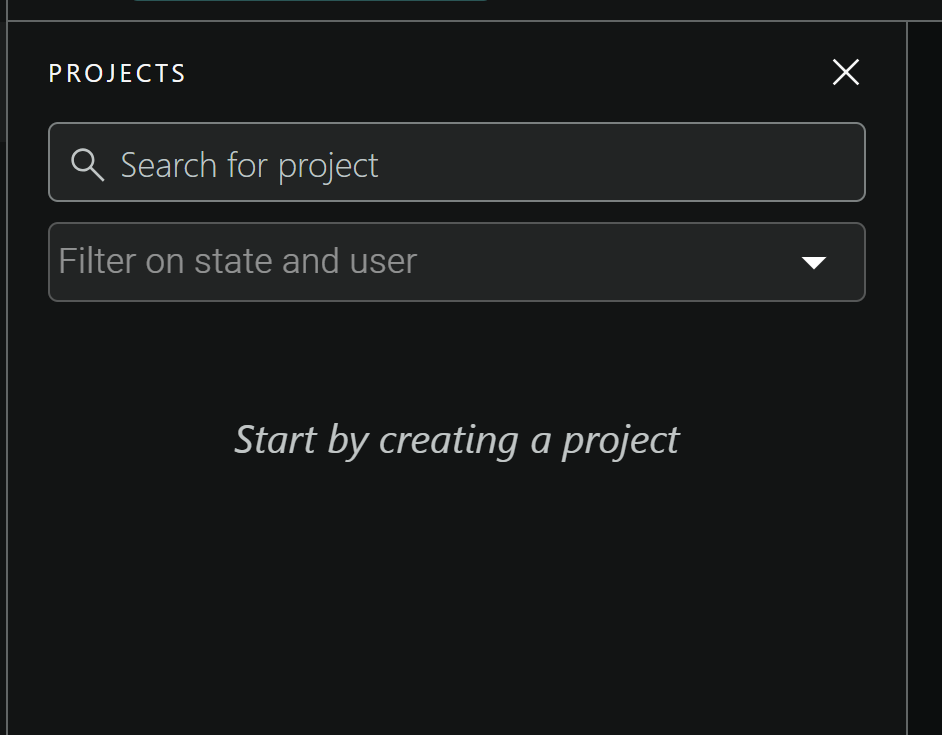
Just below the module bar is a navigation pane that helps you search for projects utilizing the search bar. This guide will explain what the navigation pane does and why it's useful. We'll go through each item from left to right on the bar.
Navigation pane components
- Project search bar : Enables you to quickly search for specific projects.
- Project filter bar Assists in filtering projects based on status and assigned users.
- Projects list : Shows all available projects with key details for easy browsing and selection. It displays a "Start by creating a project" message if no projects are available.
Compact view
To the right of the Navigation pane is a compact view, components on this view adjust dynamically based on the user's location.
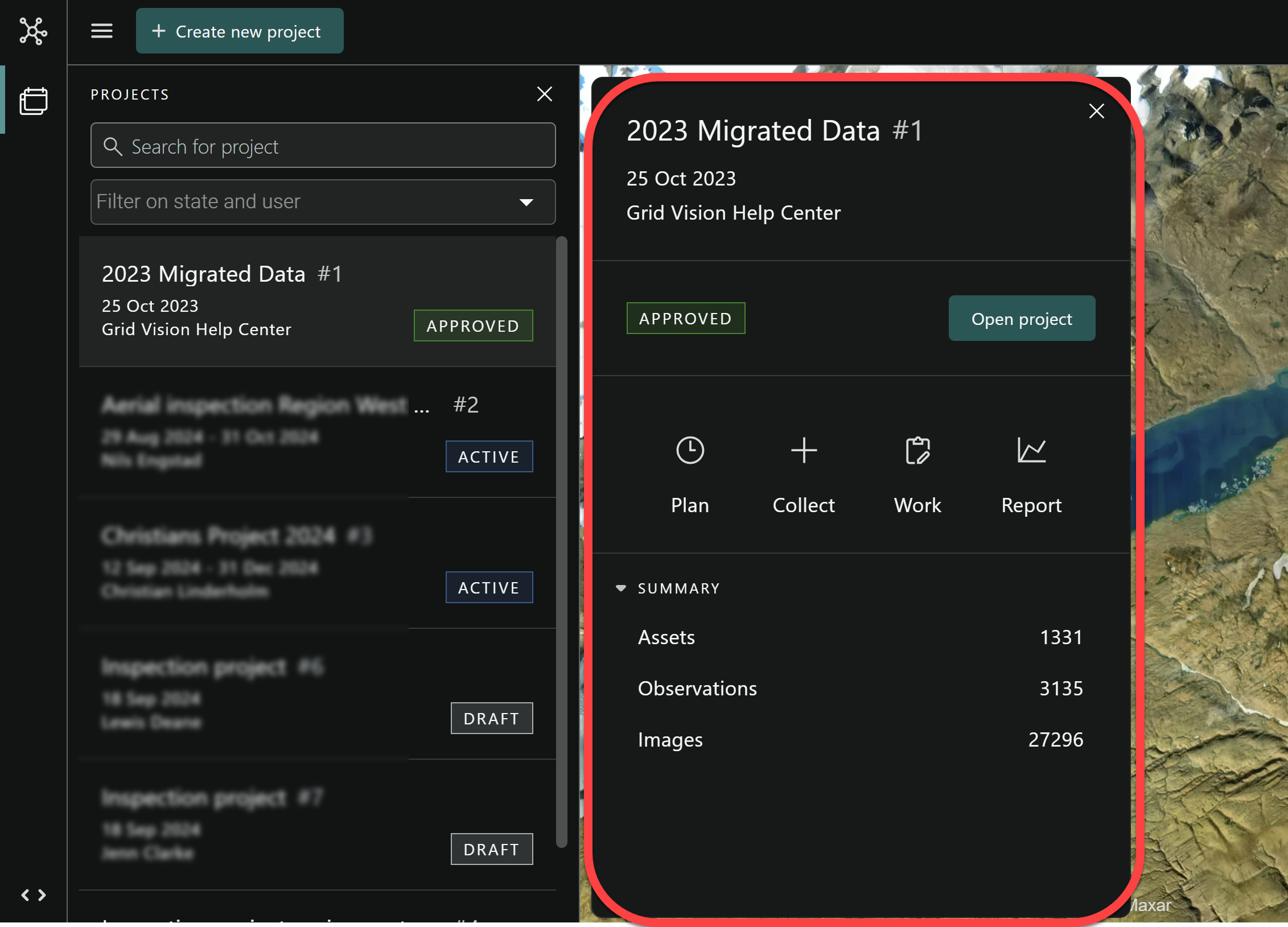
Compact view components
-
Status of the project : Indicates the current status of the project.
-
Open project button : Offers quick access to explore the project further.
-
Component of project manager : Showcases essential elements of project manager i.e. Plan, Collect, Work and Report.
- Project overview : Provides a concise summary of the project such Assets, Observations and Images.
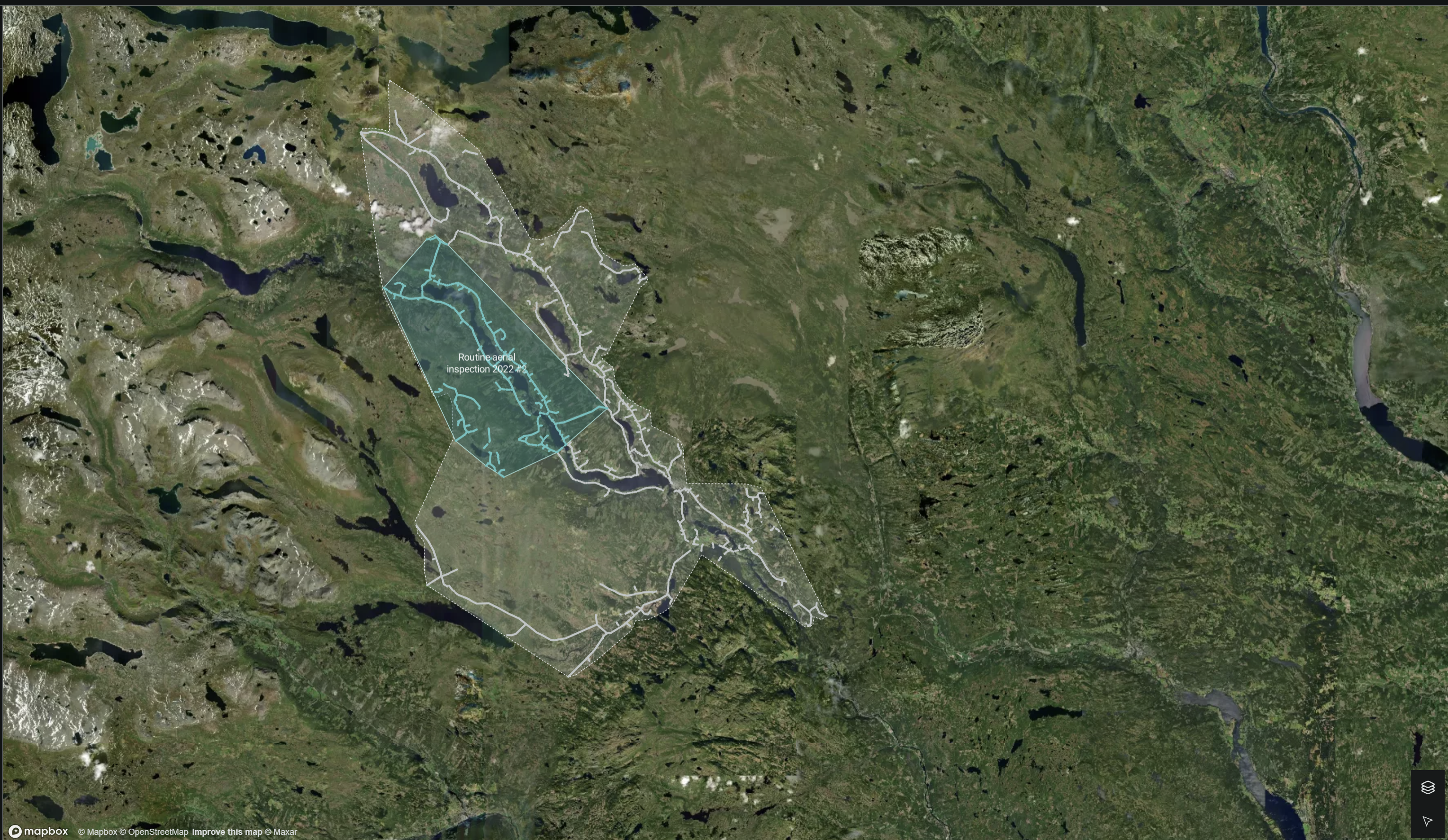
Main content area
Centered in the main content area of the page, a map is showcased. This map emphasizes the project within the grid, including the assets involved. Additionally, the surrounding grid is fully visible, offering a complete overview of the map's layout.
Selection toolbox and Map layer
Located within the main content area at the bottom of the right-hand side, the map layer and selection tool serve distinct functions. The map layer offers the ability for you to switch between Default (dark or light) and Satellite map views. Concurrently, the selection tool becomes available as you navigate from the default Project manager to a specific project location. This tool facilitates the selection of single or multiple assets, tailoring to your needs through the use of various selection tool components.
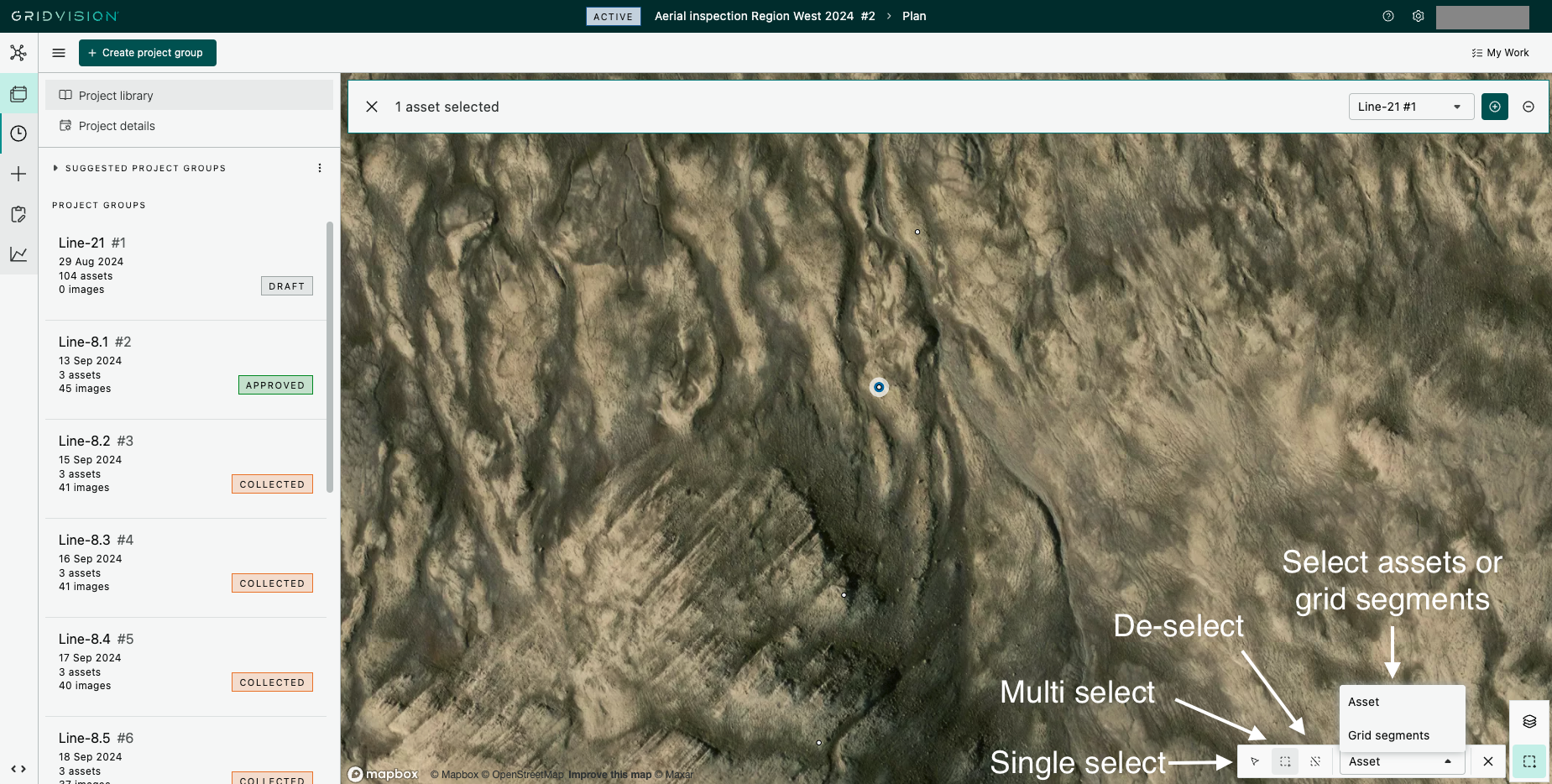
Selection tool components
-
Single selection : Enables you to select individual assets at a time on the map and also navigate the map.
-
Multiple selection : Allows you to choose multiple assets on the map using a polygon selection tool.
-
De-selection : This feature lets you unselect multiple assets that were previously selected.
-
Select Asset or Grid segment : This feature lets you either select Assets or Grid segments in the map. When selecting a Grid segment all assets included in that Grid segment will be selected.
Detail pane
Delivers comprehensive details about the selected project or map elements, enriching your project management toolkit.